

This is the internationally recognized symbol for accessibility (Photo credit: Wikipedia)
A few days ago my older sister asked my opinion on a subject. She said that New York City was considering a change to the handicap parking sign logo, and that the new logo was based on a graffiti campaign that thought the old logo needed to be replaced. I’ve since done some reading on the subject and have found that a couple of academics from Massachusetts are responsible for this. My question is why? Why change an internationally recognizable, well-established logo? My answer: hipsters gotta be hip.
I’m taking some liberty today and being perhaps a little more callous than usual, but I promise it is only because I despise political correctness! From an article at fastcodesign.com about the new accessibility sign we learn that the old accessibility logo “looks frail and immobile,” while the new suggestion is more “humanized.” I’m torn here between my support of creative exploration for new ideas, and my dislike of “PC hipstering,” which I’m unashamedly judging this whole movement to be. I want to make fun of everything in the fastcodesign.com article and this whole idea, but at the same time, congratulate the people for being involved with something that matters to them.
Well, why not do both? First, we’ll get the hard part out of the way: kudos to you folks for being involved with something that matters to you. Done. On to the fun making part…
I find it interesting that this brave new logo originated in the minds of a graduate school affiliated artist/blogger and a philosophy professor. A team that took to graffiti to spread their message. They didn’t conduct market research for their new logo design, they took to the streets and vandalized municipal signage. I’m not all that concerned about the signs they defaced, but reading between the lines reveals something interesting. If these two crusaders were so concerned with how disabled people were being represented by the old logo, why didn’t they involve the people they were hoping to release from stigmatized bondage in the form of an uncaring, misrepresentation of themselves?
Maybe they did. Maybe they sent out surveys and did logo comparisons with people on the street. I don’t know. If they didn’t, why didn’t they? Was it because they had an idea that was so great that it needed to be accepted by the world’s population immediately? Arrogance? Control? As I said, I’m reading between the lines. Take it or leave it.
Maybe I’m not the one to be pontificating on this subject. I’m not in need of specific accessibility facilitation. But still, was the old logo so insulting to people that it needed to be revamped? (And why not include all mobility limiting disabilities rather than once again only focusing on wheelchairs?) The new logo looks like a wheelchair racer, or someone standing up from a chair. If you are a wheelchair racer, I promise you that you are in better shape than I am, and will be fine parking further from the building. But that imagery is more humanizing than someone sitting still, or so I’ve read. A lot of the focus on the new logo was making the image appear active. As an amateur cartoonist, I’ll tell you how you make an image look active, you draw some horizontal lines of varying length extending away from the body in the direction away from where you want the apparent motion to take the image. That’s elementary.
Of course, it all makes sense when you consider that this idea is being adopted by New York City and Mayor Michael “Nanny” Bloomberg.
I’ve been thinking about this topic for the last few days, but I wasn’t going to write about it. The determining factor that led me to write it was what I saw on a flyer for a local theater that came in the mail today. Under the theater’s address it says “Physically Accessible.” My wife and I had a good laugh over that. Can you imagine a building not being physically accessible? Even Alcatraz was physically accessible. The Moon is physically accessible. It isn’t easy to get there, but it is physically accessible. This is how my mind made sense of it: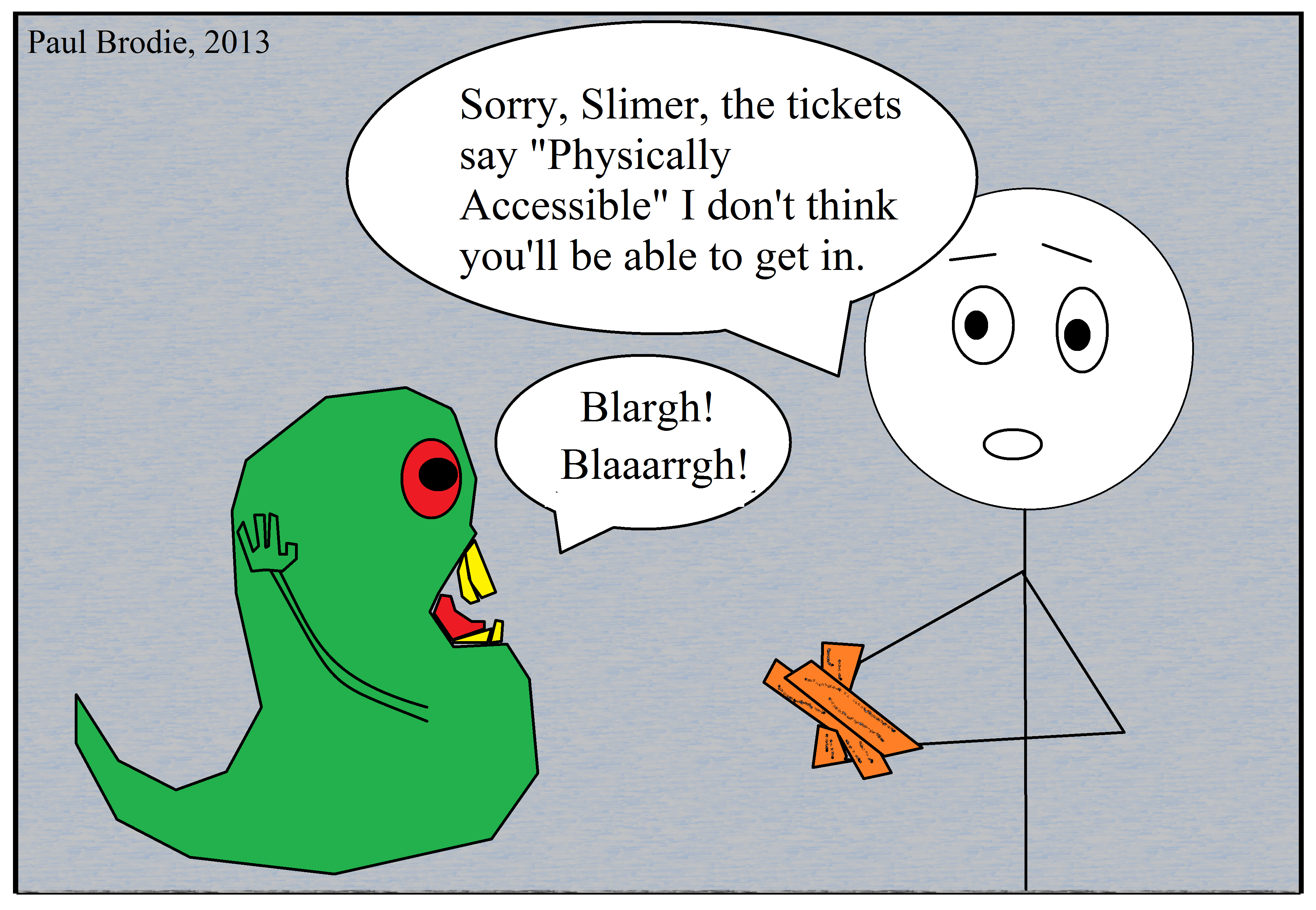
Well, he isn’t “physical.” This place is only accessible by the physical.
Is handicap such an offensive word? Disabled, too? You can’t just say wheelchair accessible? No, you can’t have any of those words, we must narrow it down to ambiguous multi-purpose words. It’s the only way to enact global sameness (2+2=5).
It always comes back to control.
My final thought: all buildings are physically accessible, if they were not, they likely would never have been built. Unless they were built by ghosts.
Related articles


As a wheelchair user that needs someone to push my wheelchair for me I don’t see how a super-fit wheelchair user zooming at super sonic speeds comes anywhere close to representing the realities of my disability. It had never occured to me that the old logo was dehumanising but it does occur to me that the revised logo places unreasonable expectations on many less physically-able wheelchair users like myself. There seems to be a common assumption now that all wheelchair users are either complete vegetables or super-humans of paralympian abilities when the majority fall somewhere in between. New logo or old it isn’t going to make my life any easier. Perhaps instead of the logo their energies would be better spent tackling the physical and social barriers that make life harder for people with all kinds of disabilities instead.
I agree, the time and energy spent trying to make things “politically correct” could be better spent on defeating issues that actually impact peoples lives. I really think this was a case of people using a social issue to vaunt themselves.
As with possibly all of the issues that fall into the spectrum of being politically correct, superficial treatments never address the underlying issue. Whatever social stigma, or actual lack of functional accessibility for public places, that applies to anyone with limited mobility or using a wheelchair, probably isn’t the result of a simple logo design. If the logo didn’t cause it, a new logo probably won’t fix it.
Thanks for commenting and bringing your personal perspective and experience into the discussion.
All buildings are accessible? Not if built before the early 90’s when the ADA was passed and major renovations were made subsequently, or are historical landmarks. Most private homes and apartments built before 1992 are not accessible unless required to by making significant modifications to the entrance of the building, or the owner decided to make them accessible. New private housing does not have to have accessibility except for the common entrance area of multi-family buildings, and most privately built condos or apartment buildings do not require accessible living units. No ghosts are involved.
I was joking, playing with the words involved. If you take it literally, what does it mean to be physically accessible? I take it to mean that it can be accessed physically as opposed to mentally, or spiritually.
What I was saying was that if the building couldn’t be accessed physically, then it couldn’t be built, because building requires physical access. I can’t think and make a house be built. That’s all I was saying, just a bit of satire or sarcasm, or being a wise guy is all.
I think people should say what they mean rather than coat it with some type of politically correct sugar-free syrup. Physically accessible is supposed to mean that it is wheelchair accessible, or more convenient than stairs for other forms of mobility impairment, but that isn’t clear. Just say the standard “handicap accessible” or “wheelchair accessible” or “ramp and elevator available instead of stairs.” That was the commentary I was hiding in my jokes.
Sorry for the confusion, but thanks for commenting!